


Faces on Packaging: Why Great Product Packaging Design Doesn't Always Click Online
Product packaging design is the process of shaping a package's structure, graphics, and messaging to attract buyers and protect the product. Faces and human imagery boost shelf appeal in physical retail, but the same designs can underperform online, where thumbnail legibility, clarity, and readable text drive clicks.
Walk any grocery aisle and you'll notice something: the packages that stop you almost always have a face on them. A smiling farmer on a carton of eggs. A cartoon mascot on a cereal box. Even carved faces on pumpkins in the seasonal display work the same trick — human brains are wired to lock onto faces before anything else. That instinct is one of the most reliable levers in product packaging design. But here's the twist that trips up restaurants, ghost kitchens, and food brands alike: the exact design choices that win the shelf can quietly lose the screen. A face that commands attention at arm's length becomes an unreadable smudge in a 100-pixel delivery-app thumbnail. In this guide, we'll break down why faces dominate in-store, why shelf-winning designs stall online, and how foodservice operators can build packaging that performs in both worlds.

TL;DR — Shelf Appeal vs. Online Appeal at a Glance
- Faces work in-store: Human faces trigger attention in as little as 100 milliseconds — faster than any other image category — which is why face-forward packaging wins physical shelves.
- Packaging drives purchases: 72% of Americans say a product's packaging design influences their purchase decisions, and 81% say it influences gift selection (Ipsos, for the Paper and Packaging Board).
- Online is a different game: U.S. online grocery hit a record $12.7 billion in December 2025 (up 32% year over year), and nearly 75% of restaurant traffic is now off-premises — meaning your packaging is judged as a thumbnail and an unboxing, not a shelf presence.
- The fix: Design for two contexts. Keep the face for shelf and unboxing moments; lead with bold, legible product names, high contrast, and simple silhouettes for thumbnails.
| Design Factor | Wins on the Shelf | Wins Online |
|---|---|---|
| Focal element | Faces, mascots, human imagery | Product itself, bold name, clear category cue |
| Text | Layered storytelling, small claims | One large, legible headline; minimal copy |
| Detail level | Rich texture and illustration reward close viewing | Simple shapes that survive 100–160 px thumbnails |
| Color strategy | Stand out against adjacent competitor packages | Stand out against a white/gray app background |
| Moment of truth | 3–5 seconds at arm's length in the aisle | Sub-second scroll on a phone, then the unboxing |
What Is Product Packaging Design?
Product packaging design is the discipline of planning a package's structure (box, cup, sleeve, tray), graphics (color, typography, imagery), and messaging (name, claims, story) so it protects the product, attracts the right buyer, and communicates the brand in seconds. For food businesses, packaging design for food products carries extra jobs: it must meet food-safety and labeling requirements, hold up to heat and moisture, and keep food presentable from kitchen to table.
Packaging has always been judged in one arena: the retail shelf. That's changing fast. With nearly 75% of restaurant traffic now happening off-premises, according to the National Restaurant Association's 2025 Off-Premises Restaurant Trends report, and U.S. online grocery sales hitting a record $12.7 billion in December 2025 — up 32% year over year (Brick Meets Click/Mercatus) — your package now has to perform in two completely different arenas: the physical shelf and the glowing rectangle of a phone screen. (Figures current as of August 2026.)
That split — shelf appeal versus online appeal — is the single most overlooked idea in retail packaging design today, and it's the reason a package that flies off shelves can go ignored in a delivery app.
Why Do Faces and Human Imagery Boost Shelf Appeal?
Faces boost shelf appeal because the human visual system detects faces faster than any other kind of image. In a landmark eye-movement study, Crouzet, Kirchner, and Thorpe (2010, Journal of Vision) found that people can initiate eye movements toward a face in as little as 100 milliseconds — literally faster than conscious thought. On a crowded shelf where the average shopper gives each facing a fraction of a second, a face is a biological shortcut to attention.
And attention converts. In an Ipsos survey conducted for the Paper and Packaging Board, 72% of Americans said a product's packaging design often influences their purchase decisions — and when buying a gift, that number jumps to 81%. Shelf appeal packaging isn't decoration; it's a measurable sales lever. (Current as of August 2026.)
Faces work on packaging in three ways:
- Attention capture. As the eye-tracking research shows, faces hijack gaze before shoppers consciously choose where to look.
- Emotional transfer. A warm smile on a package transfers warmth to the product. This is why founder portraits, chef illustrations, and mascots are perennial packaging design ideas for food brands.
- Implied trust. A named, pictured human signals accountability — "a real person stands behind this."
This face instinct is so strong that we decorate with faces even when no brand is involved — think of carved faces on pumpkins every October. A jack-o'-lantern is, functionally, packaging design: a plain orange gourd transformed into an attention magnet by two triangle eyes and a grin. Seasonal food packaging borrows the same trick constantly, from Halloween treat boxes with jack-o'-lantern motifs to holiday sleeves with Santa's face. Faces make objects feel alive, and alive gets noticed.
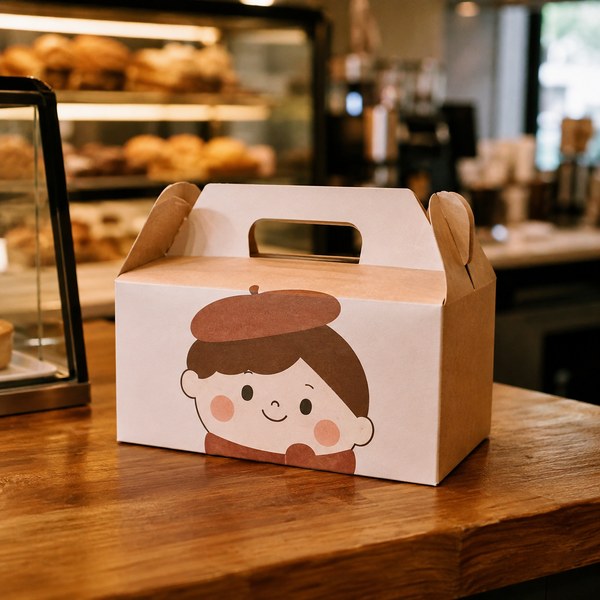
In 15+ years supplying 40,000+ foodservice operations, we've watched this play out at the counter, not just in the data. Bakeries and cafés that add a face — a founder illustration, a winking mascot, even a simple hand-drawn smile on a kraft box — consistently report that customers photograph and post their packaging more often. On a physical counter or shelf, faces earn a second look.
Why Do Shelf-Winning Designs Underperform Online?
Shelf-winning designs underperform online because e-commerce strips away everything that makes a face work: size, context, and the split-second gaze advantage. Online, your package is a thumbnail — often 100 to 160 pixels wide — sandwiched between competitors on a stark white grid, viewed on a phone during a scroll. Three specific failures show up again and again:
1. Thumbnail illegibility
A detailed face illustration that rewards close viewing at arm's length collapses into visual noise at thumbnail size. Fine linework disappears. Expressions blur. Worse, the face crowds out the one thing an online shopper actually needs: what the product is. On a shelf, the category is obvious from the aisle you're standing in. In an app, the thumbnail has to do the category's job too. If a shopper can't tell "cookie box" from "candle box" in half a second, they scroll past.
2. Context collapse
Shelf design is competitive camouflage-breaking: your package is designed to pop against the specific packages beside it. Online, everything sits on the same white or gray background, in randomized order, with no adjacency to design against. The cues that made your design distinctive in-aisle — being the only face in a sea of product photography, being the only matte package on a glossy shelf — vanish. What survives context collapse is simplicity: bold color fields, chunky typography, and a clear product silhouette.
3. The moment of truth moves
In-store, packaging closes the sale before purchase. Online, the buyer never touches the package until it arrives — so packaging's persuasion job shifts to the unboxing, where it drives reviews, reorders, and social sharing instead of first purchase. This is where faces get their revenge: a delightful face-forward design that did nothing in the thumbnail can shine at the doorstep, turning a takeout order into a photographed, shared moment. The design didn't fail; it was deployed at the wrong stage of the funnel.
The practical conclusion: don't abandon faces — re-sequence them. Lead your online listing images with legibility (product name, category cue, appetite appeal) and let the face carry the physical experience: the box in hand, the bag on the doorstep, the sticker sealing the wrap.
Product Packaging Design Principles Every Operator Should Know
Whether you're refreshing a takeout program or launching a retail line, a few classic frameworks keep food packaging design decisions honest.
What are the 4 C's of packaging?
The 4 C's of packaging are Clarity, Consistency, Creativity, and Convenience. Clarity means a shopper instantly understands what the product is. Consistency means the package matches your brand everywhere it appears — menu, app, storefront. Creativity is the memorable twist (that face, that color) that earns attention. Convenience covers the practical experience: easy to open, carry, stack, reheat, and dispose of.
What are the 5 P's of packaging?
The 5 P's of packaging are Protection, Presentation, Promotion, Practicality, and Planet. Protection keeps food safe and intact in transit — the non-negotiable. Presentation is how the food looks on opening. Promotion is the package's job as a silent salesperson. Practicality covers cost, storage, and workflow in a real kitchen. Planet addresses recyclability and compostability — an area where regulation is moving fast, as we covered in our guide to new packaging laws for 2025 and our look at compostable packaging verifications and end-of-life guidelines in the U.S.
What are the main types of product packaging?
Types of product packaging fall into three tiers. Primary packaging touches the product directly — the cup, clamshell, tray, or wrapper. Secondary packaging groups and brands primary units — the sleeve, carrier, or printed box. Tertiary packaging handles bulk transport — cases and cartons. For food businesses, structural innovation matters at every tier: even primary trays are being rethought, as with the paperboard MAP tray emerging as an alternative to plastic in fresh meat packaging. And because primary packaging also affects how long food stays fresh, structure should be chosen alongside your best practices for extending the shelf life of perishables.
A dual-context design checklist
Before you approve any design, score it against both arenas:
- Squint test (online): Shrink the design to 120 pixels. Can you still name the product and category? If not, enlarge the name and simplify.
- Arm's-length test (shelf): View a printed mockup from three feet. Does one element — ideally a face or bold focal graphic — pull the eye?
- White-background test: Drop the thumbnail on plain white. Does it still have edges, contrast, and presence?
- Unboxing test: Open the package as a customer would. Is there a reveal moment worth photographing?
- Compliance pass: Confirm labels, claims, and materials meet current FDA labeling rules and any state packaging laws before printing.
How Does This Play Out in Foodservice? Takeout, Labels, and Gift Packaging
Restaurants and food businesses live this shelf-versus-screen split more intensely than any CPG brand, because off-premises is now the main stage. The National Restaurant Association projects $1.5 trillion in U.S. restaurant industry sales for 2025, and with almost three of four orders leaving the building, your packaging is your dining room for most customers. (Current as of August 2026.)
Here's how the dual-context principles translate into real operator decisions:
Takeout containers: the delivery-app thumbnail problem
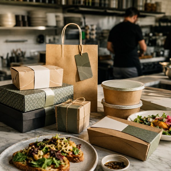
On delivery apps, customers see your food photo — not your box — so many operators assume container design doesn't matter online. It does, twice: first in your listing photos (branded packaging in food photography signals professionalism and consistency), and second at handoff, where the container becomes the entire brand experience. Choose take out containers & to go boxes with clean, printable surfaces so your branding survives both stages. Our foodservice customers consistently tell us the same thing: upgrading from generic containers to branded, sturdy packaging measurably improves review scores that mention "arrived well-packaged" — and those reviews feed the algorithmically ranked listings that drive reorders.
Labels and stickers: the cheapest face-lift in packaging
Not every operation can afford custom product packaging with full custom printing — and it doesn't need to. A well-designed label on a stock kraft box delivers 80% of the branding at a fraction of the cost, and it's the easiest place to deploy a face: a founder portrait, a chef illustration, a mascot seal. Browse labels & stickers to test face-forward designs on your existing containers before committing to a custom print run. In our experience supplying independent cafés and multi-unit groups alike, label-first branding is the fastest, lowest-risk way to A/B test packaging design ideas in the real world: run two label designs for a month each and compare social tags and repeat orders.
Gift packaging: where faces and design earn the most
Remember the Ipsos finding: 81% of consumers say packaging design influences gift selection — the highest-stakes arena in retail packaging design. Holiday boxes, curated bundles, and edible gifts are bought with the eyes first, and this is where expressive design (yes, including faces — from elegant portrait illustrations to playful jack-o'-lantern grins on seasonal treat boxes) pays for itself. Explore gift packaging to build seasonal programs that photograph beautifully in-store and unbox memorably at home.
Frequently Asked Questions
How do I design my own product packaging?
Design your own product packaging in six steps: (1) define the buying context — shelf, delivery app, e-commerce, or gift; (2) choose the structure first (box, cup, sleeve, tray) based on protection and workflow; (3) write the hierarchy — product name largest, category cue second, brand third; (4) add one focal element, such as a face, mascot, or bold graphic; (5) run the squint test at thumbnail size and the arm's-length test in print; (6) verify labeling compliance before printing. Start with labels on stock containers to test cheaply before ordering custom product packaging.
What are the 4 C's of packaging?
The 4 C's of packaging are Clarity, Consistency, Creativity, and Convenience: instantly communicate what the product is, match your brand across every touchpoint, add a memorable creative element, and make the package easy to open, carry, and dispose of.
What are the 5 P's of packaging?
The 5 P's of packaging are Protection, Presentation, Promotion, Practicality, and Planet: protect the product in transit, present it attractively on opening, promote the brand like a silent salesperson, stay practical for cost and kitchen workflow, and minimize environmental impact.
What are the different types of product packaging design?
The main types of product packaging include primary packaging (direct food contact — cups, clamshells, trays, wrappers), secondary packaging (branded boxes, sleeves, and carriers), and tertiary packaging (bulk shipping cases). By style, common approaches include minimalist, illustrated/character-driven (face-forward), photography-led, pattern-based, and structural/die-cut designs — each with different strengths on shelves versus screens.
What is the -_- face called?
The "-_-" face is commonly called the expressionless face (or "annoyed/unamused face") — a kaomoji-style emoticon read as deadpan irritation or weary indifference. It's a neat proof of how powerfully humans read faces: three keystrokes convey a complete emotional state — the same instinct that makes faces such effective tools on packaging.
Conclusion: Design for the Shelf and the Screen
Faces on packaging aren't a gimmick — they're one of the most scientifically grounded tools in product packaging design, capable of grabbing attention in a tenth of a second and transferring warmth and trust to your brand. But shelf appeal and online appeal are different games with different rules. Win both by re-sequencing: legibility, contrast, and simplicity for the thumbnail; personality, faces, and craft for the shelf and the unboxing. Score every design against both contexts before you print, and let your packaging work as hard in a delivery bag as it does in a display case.
Ready to put this into practice? Build your program with take out containers & to go boxes for daily off-premises volume, test face-forward branding affordably with labels & stickers, and capture the high-margin seasonal moment with gift packaging that earns the second look — on the shelf and on the doorstep.


1 comment
Very Informative Blog.
Shelf Life Testing |Visit us: https://farelabs.com/services/testing/shelf-life-testing-lab/
Shelf Life Testing Lab |
shelf life testing labs near me |
Shelf Life Testing Lab in Gurgaon |
Shelf Life Testing Lab in India |
Shelf Life Testing services